前言
本文的文字及图片来源于网络,仅供学习、交流使用,不具有任何商业用途,版权归原作者所有,如有问题请及时联系我们以作处理。
作者:斑点鱼

matplotlib常见图表绘制——直方图
series.hist():单个直方图
# 多个直方图
df = pd.DataFrame({'f': np.random.randn(1000) + 1, 'i': np.random.randn(1000),
's': np.random.randn(1000) - 1, 'h': np.random.randn(1000)-2},
                   columns=['f', 'i', 's','h'])
df.hist(bins=50)
dataframe.hist():多个直方图
# 多个直方图
df = pd.DataFrame({'f': np.random.randn(1000) + 1, 'i': np.random.randn(1000),
's': np.random.randn(1000) - 1, 'h': np.random.randn(1000)-2},
                   columns=['f', 'i', 's','h'])
df.hist(bins=50)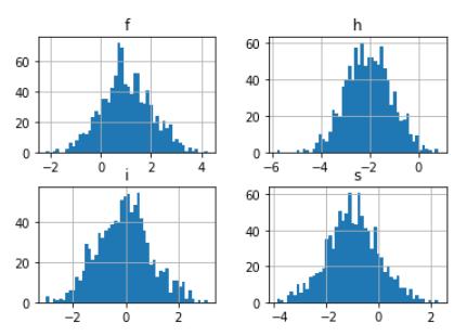
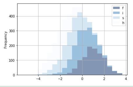
plt.plot.hist(stacked=True)堆叠直方图
#堆叠直方图stacked=True
df = pd.DataFrame({'f': np.random.randn(1000) + 1, 'i': np.random.randn(1000),
's': np.random.randn(1000) - 1, 'h': np.random.randn(1000)-2},
                   columns=['f', 'i', 's','h'])
df.plot.hist(stacked=True, bins=20,colormap='Blues_r',alpha=0.5,grid=True)