绘制 GNSS 速度场
本图使用美国西部的 GNSS 测站速度场数据,数据来自加州大学圣迭戈分校。在使用 ax.quiver() 方法绘制站速度矢量时,由于 matplotlib 自动确定的矢量长度比较短,不能够表现足够的细节。因此使用 scale_units 属性指定矢量长度单位,然后使用 scale 设置缩放程度。加州西部是著名的圣安德列斯断层,从下图中可以看出其两侧迥异的地质变化。
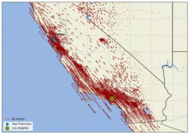
美国西部 GNSS 速度场
import numpy as np
import matplotlib.pyplot as plt
import cartopy.crs as ccrs
import cartopy.feature as cfeature

# Download the GPS velocity field from
# https://topex.ucsd.edu/CGM/01_GPS/wus_gps_final_names.dat
velo = np.genfromtxt('wus_gps_final_names.dat', usecols=range(1, 5),
                     names=('lat', 'lon', 'Vn', 'Ve'), skip_header=1)
# Coordinates of Los Angeles & San Francisco
l_a, s_f = (-118.30, 34.12), (-122.43, 37.74)

fig = plt.figure(figsize=(12, 12))
# Set projection
ax = plt.axes(projection=ccrs.Miller(central_longitude=-120))
# Add ocean, land, rivers, lakes & boundary of states
ax.add_feature(cfeature.OCEAN.with_scale('50m'))
ax.add_feature(cfeature.LAND.with_scale('50m'))
ax.add_feature(cfeature.RIVERS.with_scale('50m'))
ax.add_feature(cfeature.LAKES.with_scale('50m'))
ax.add_feature(cfeature.STATES.with_scale('50m'))
# Plot quivers
qs = ax.quiver(velo['lon'], velo['lat'], velo['Ve'], velo['Vn'], width=0.0015,
               scale_units='inches', scale=85, color='darkred',
               transform=ccrs.PlateCarree())
# Plot a legend for quiver
ax.quiverkey(qs, 0.04, 0.1, 20, '20 mm/yr', labelpos='E')
# Plot Los Angeles & San Francisco, as reference
ax.scatter(s_f[0], s_f[1], s=90, label='San Francisco', color='darkcyan',
           transform=ccrs.Geodetic())
ax.scatter(l_a[0], l_a[1], s=210, label='Los Angeles', color='olivedrab',
           transform=ccrs.Geodetic())
ax.legend(loc='lower left')
# Plot grid lines
ax.gridlines(linestyle='--')
ax.set_extent([-126, -113, 32, 40])

plt.show()
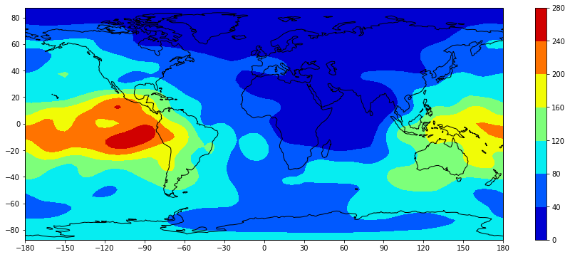
绘制电子含量分布图
Cartopy 以 matplotlib 包作为基础,可以使用 matplotlib 中的方法来绘制等值线图,只需在绘制时使用 Cartopy 处理地图投影变形。这里以绘制全球电离层电子含量图为例,模型来自北京航空航天大学·前沿电离层实验室,但只截取其产品文件 whug1420.18i 中第一个时段的数据,即使用的 1st-tecmap.dat 文件。
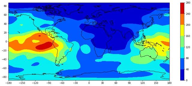
全球电子含量分布图
import numpy as np
import matplotlib.pyplot as plt
import cartopy.crs as ccrs

# Read VTEC data from a file
with open('1st-tecmap.dat') as src:
    data = [line for line in src if not line.endswith('LAT/LON1/LON2/DLON/H\n')]
    tec = np.fromstring(''.join(data), dtype=float, sep=' ')

# Generate a geodetic grid
nlats, nlons = 71, 73

lats = np.linspace(-87.5, 87.5, nlats)
lons = np.linspace(-180, 180, nlons)
lons, lats = np.meshgrid(lons, lats)

tec.shape = nlats, nlons

fig = plt.figure(figsize=(8, 3))
# Set projection
ax = plt.axes(projection=ccrs.PlateCarree())
# Plot contour
cp = plt.contourf(lons, lats, tec, transform=ccrs.PlateCarree(), cmap='jet')
ax.coastlines()
# Add a color bar
plt.colorbar(cp)
# Set figure extent & ticks
ax.set_extent([-180, 180, -87.5, 87.5])
ax.set_xticks([-180, -150, -120, -90, -60, -30, 0, 30, 60, 90, 120, 150, 180])
ax.set_yticks([-80, -60, -40, -20,   0,  20,  40,  60,  80])

plt.show()
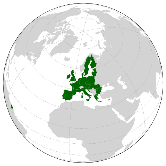
突出显示某区域
Cartopy 默认对所有地物使用相同的外观,如果需要突出显示某些地物,就必须进行筛选。这里从 Natural Earth 提供的小比例尺国界数据中,提取出欧盟国家,然后使用 ax.add_geometries() 方法将它们加入到绘图元素中。
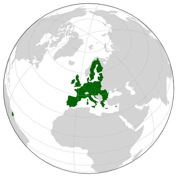
欧洲联盟
import matplotlib.pyplot as plt
import cartopy.crs as ccrs
import cartopy.feature as cfeature
import cartopy.io.shapereader as shpreader

# Country names in Europe Union, exported from Wikipedia:
# https://en.wikipedia.org/wiki/European_Union
eu_country_names = ('Austria', 'Belgium', 'Bulgaria', 'Croatia', 'Cyprus',
                    'Czechia', 'Denmark', 'Estonia', 'Finland', 'France',
                    'Germany', 'Greece', 'Hungary', 'Ireland', 'Italy',
                    'Latvia', 'Lithuania', 'Luxembourg', 'Malta',
                    'Netherlands', 'Poland', 'Portugal', 'Romania', 'Slovakia',
                    'Slovenia', 'Spain', 'Sweden', 'United Kingdom')

# Create a .shp file reader
shp_file = shpreader.natural_earth(resolution='110m', category='cultural',
                                   name='admin_0_countries')
shp_reader = shpreader.Reader(shp_file)
# Reader the shape file
records = shp_reader.records()
# Collect the European Union countries
eu_countries = []
for rec in records:
    if rec.attributes['NAME'] in eu_country_names:
        eu_countries.append(rec)

# Start ploting
fig = plt.figure(figsize=[6, 6])
# Set projection
ax = plt.axes(projection=ccrs.Orthographic(central_latitude=50,
                                           central_longitude=10))
# Add land
ax.add_feature(cfeature.LAND, facecolor='lightgray')
# Plot the European Union countries
for country in eu_countries:
    ax.add_geometries([country.geometry], crs=ccrs.PlateCarree(),
                      facecolor='darkgreen')
# Plot gridlines
ax.gridlines(linestyle='--')
# Show figure
plt.show()
PS:如有需要Python学习资料的小伙伴可以加下方的群去找免费管理员领取.

可以免费领取项目实战视频

绘制 GNSS 速度场
本图使用美国西部的 GNSS 测站速度场数据,数据来自加州大学圣迭戈分校。在使用 ax.quiver() 方法绘制站速度矢量时,由于 matplotlib 自动确定的矢量长度比较短,不能够表现足够的细节。因此使用 scale_units 属性指定矢量长度单位,然后使用 scale 设置缩放程度。加州西部是著名的圣安德列斯断层,从下图中可以看出其两侧迥异的地质变化。
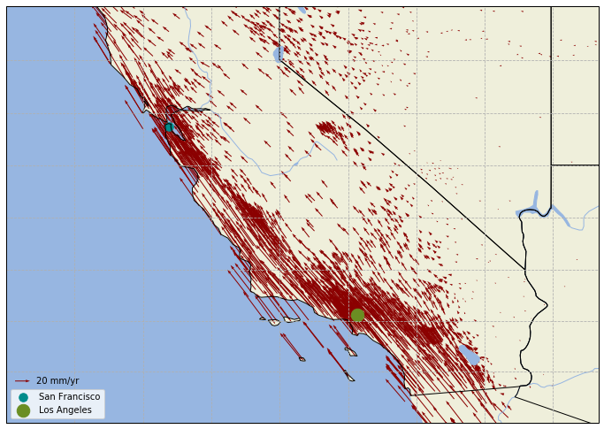
美国西部 GNSS 速度场
1 |
import numpy as np |
绘制电子含量分布图
Cartopy 以 matplotlib 包作为基础,可以使用 matplotlib 中的方法来绘制等值线图,只需在绘制时使用 Cartopy 处理地图投影变形。这里以绘制全球电离层电子含量图为例,模型来自北京航空航天大学·前沿电离层实验室,但只截取其产品文件 whug1420.18i 中第一个时段的数据,即使用的 1st-tecmap.dat 文件。
全球电子含量分布图
1 |
import numpy as np |
突出显示某区域
Cartopy 默认对所有地物使用相同的外观,如果需要突出显示某些地物,就必须进行筛选。这里从 Natural Earth 提供的小比例尺国界数据中,提取出欧盟国家,然后使用 ax.add_geometries() 方法将它们加入到绘图元素中。
欧洲联盟
1 |
import matplotlib.pyplot as plt |